
Rainbow Shade
Visual Identity for Rainbow Shade.
The brief required consideration of the company’s position in the market, distinguishing itself amongst the clutter and noise of the industry. With clean lines and subtlety, a shade star icon was designed and placed inside the negative space of the letter B of ‘Rainbow’. This star shade symbol was then outworked across the rest of the identity. Bold and bright colours were chosen both to grab audiences attention and to distinguish between different product offerings. Custom illustrations and photography were crafted to further express the brand’s essence - enjoying Australian outdoor living.

Logo on Signage

Icon and Thinking Process

Colour Palette

Typography

Product Logos

Business Card

Website. The shade star icon has been pulled apart to be used as a connecting tab across content..
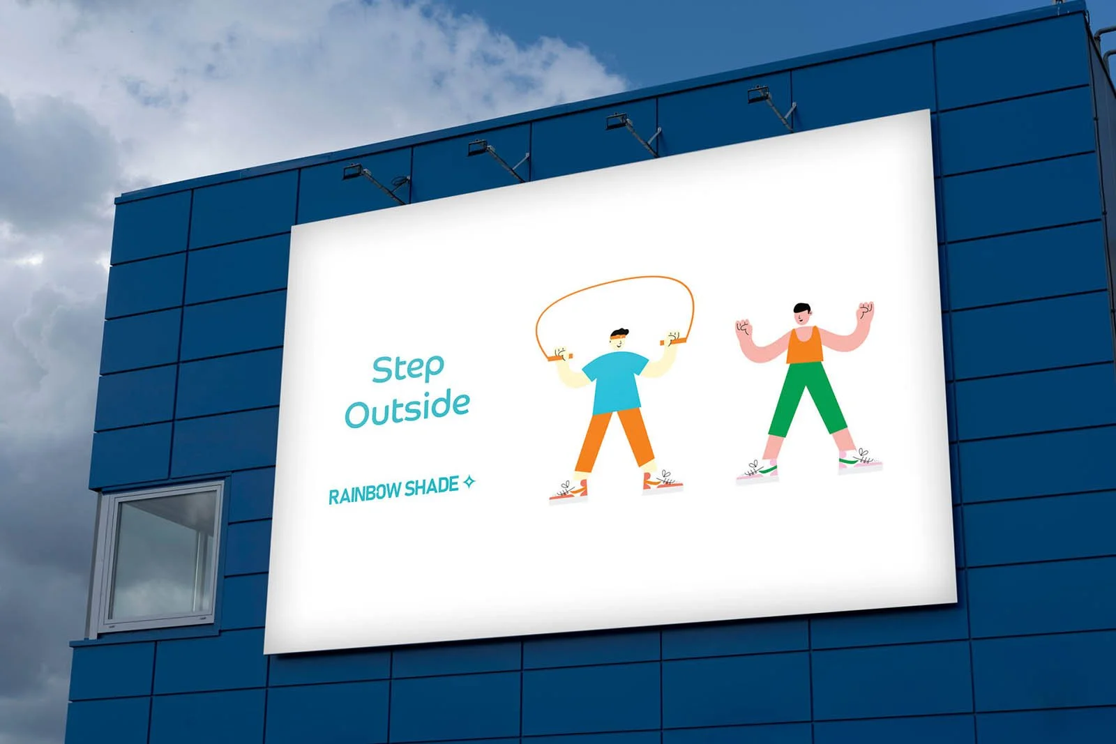
Signage with custom illustrations
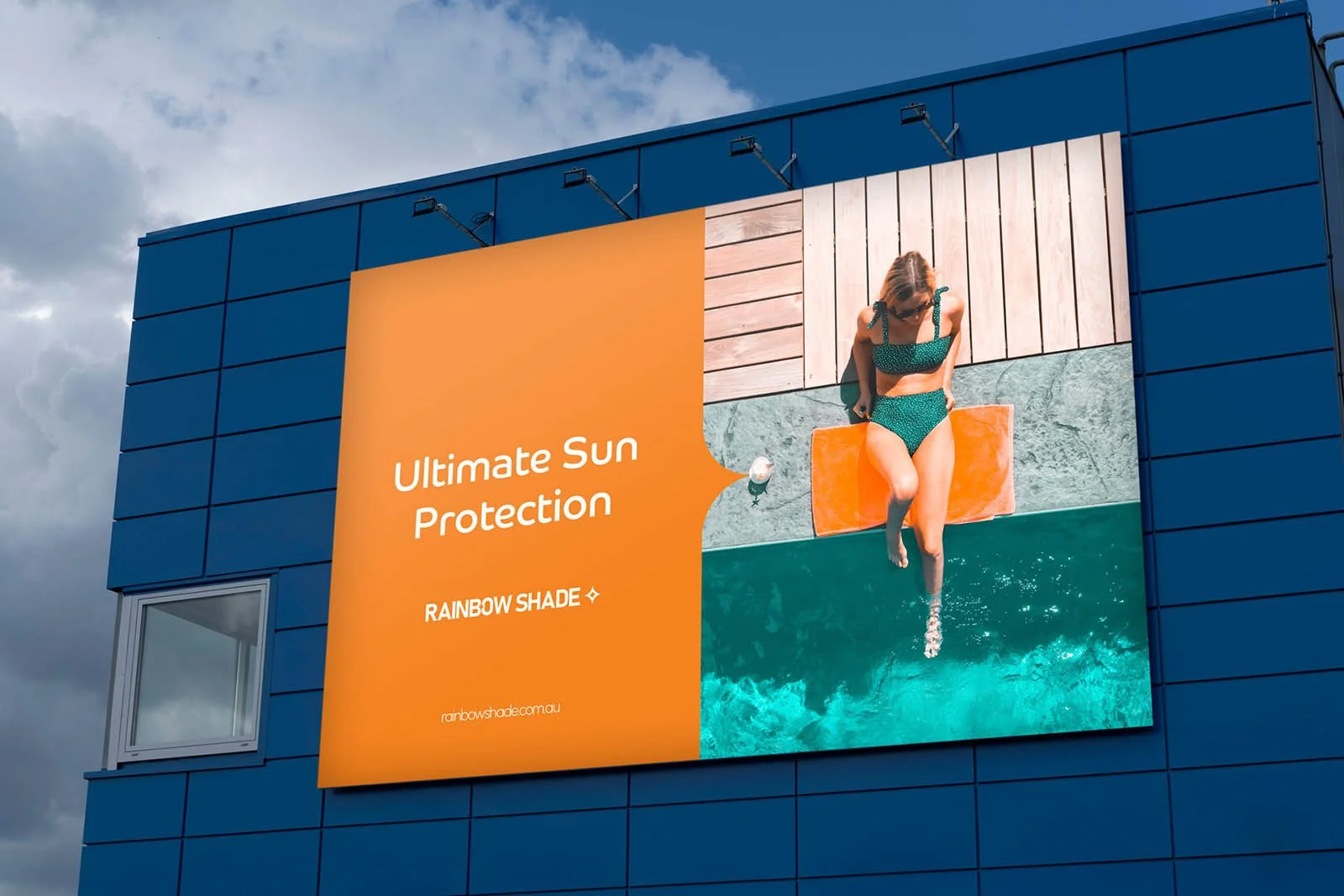
Signage
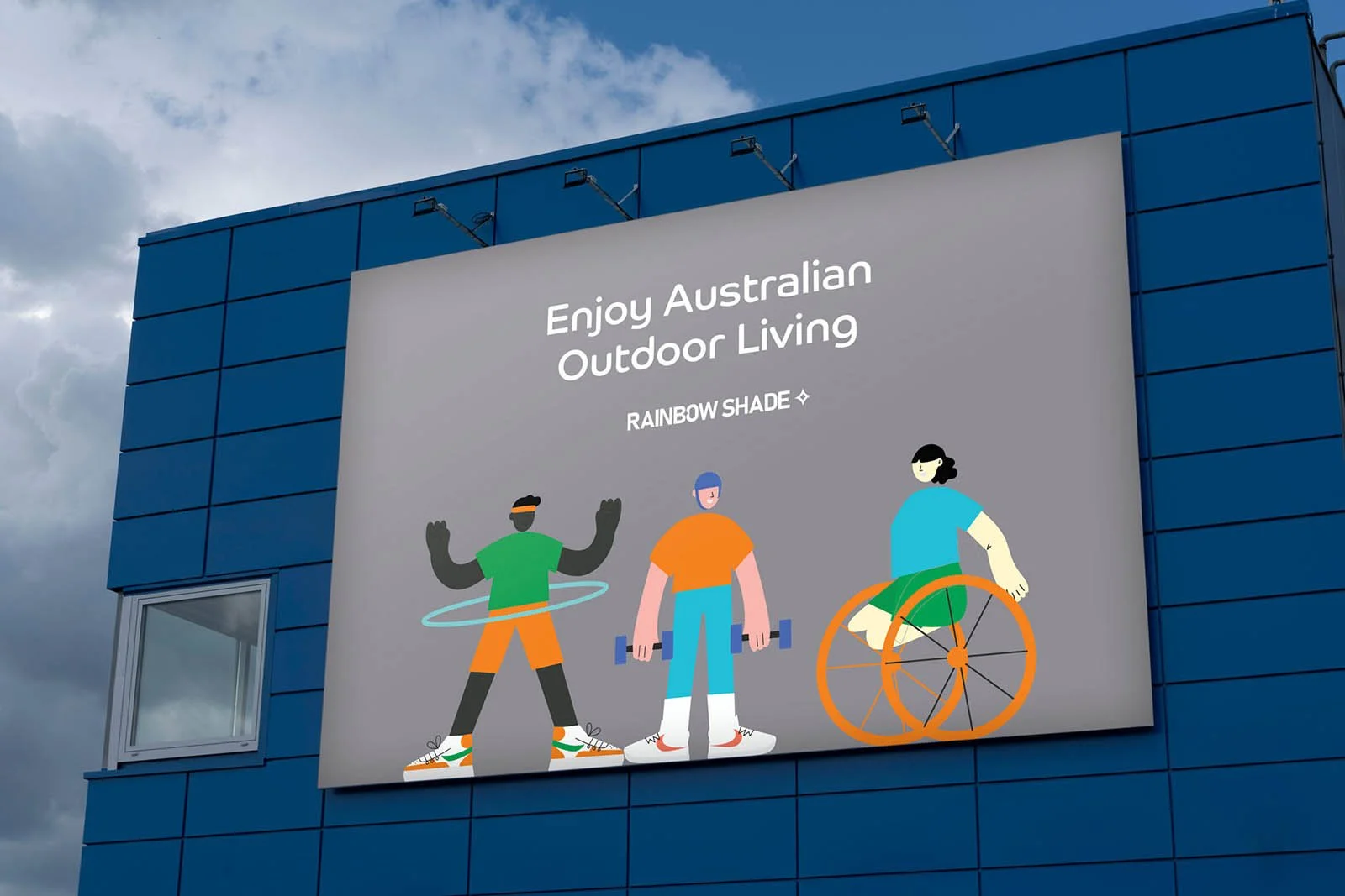
Signage with custom illustrations

Owners Manual
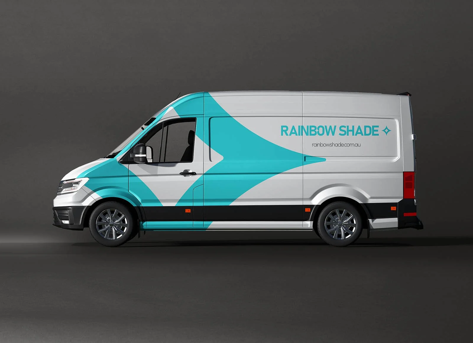
Vehicle Wrap