
Rainbow Shade
Scope: Brand strategy · Logo design · Visual identity · Colour system · Custom illustration · Photography direction · Signage · Vehicle wrap · Website design
Rainbow Shade had a good product in a crowded market. The brief was to build a brand that stood apart from the visual noise of the outdoor products industry — something bold enough to be noticed, considered enough to be trusted.
The design thinking started with the logo. Rather than reaching for obvious shade-related imagery, Studio Joel found the answer within the brand name itself: a shade star icon hidden in the negative space of the letter 'B' in Rainbow. It's the kind of mark that rewards attention — once you see it, you can't unsee it.
From there, the identity was built out in full: a bold colour system to distinguish between product lines, custom illustrations and photography to capture the feeling of Australian outdoor living, business cards, signage, a vehicle wrap, and a website where the shade star icon was repurposed as a structural content element — a connecting tab that pulled the layout together.
This is a local business that got a world-class brand — one that works on the side of a van and on a showroom wall equally well.

Logo on Signage

Icon and Thinking Process

Colour Palette

Typography

Product Logos

Business Card

Website. The shade star icon has been pulled apart to be used as a connecting tab across content..
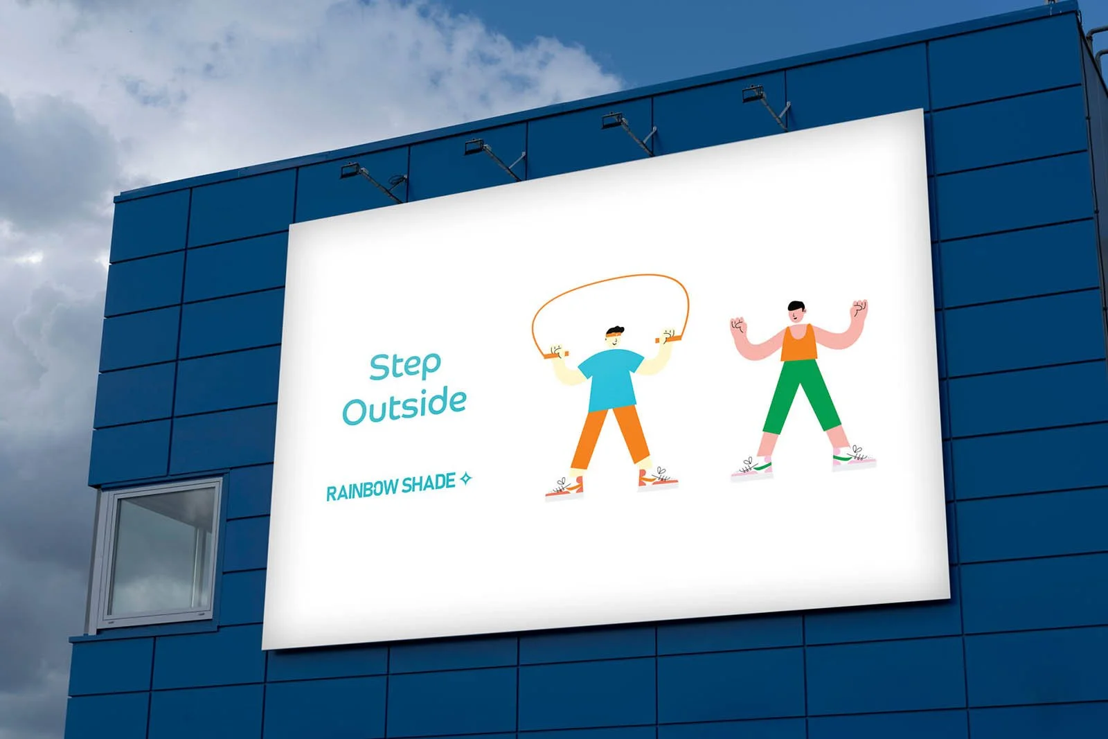
Signage with custom illustrations
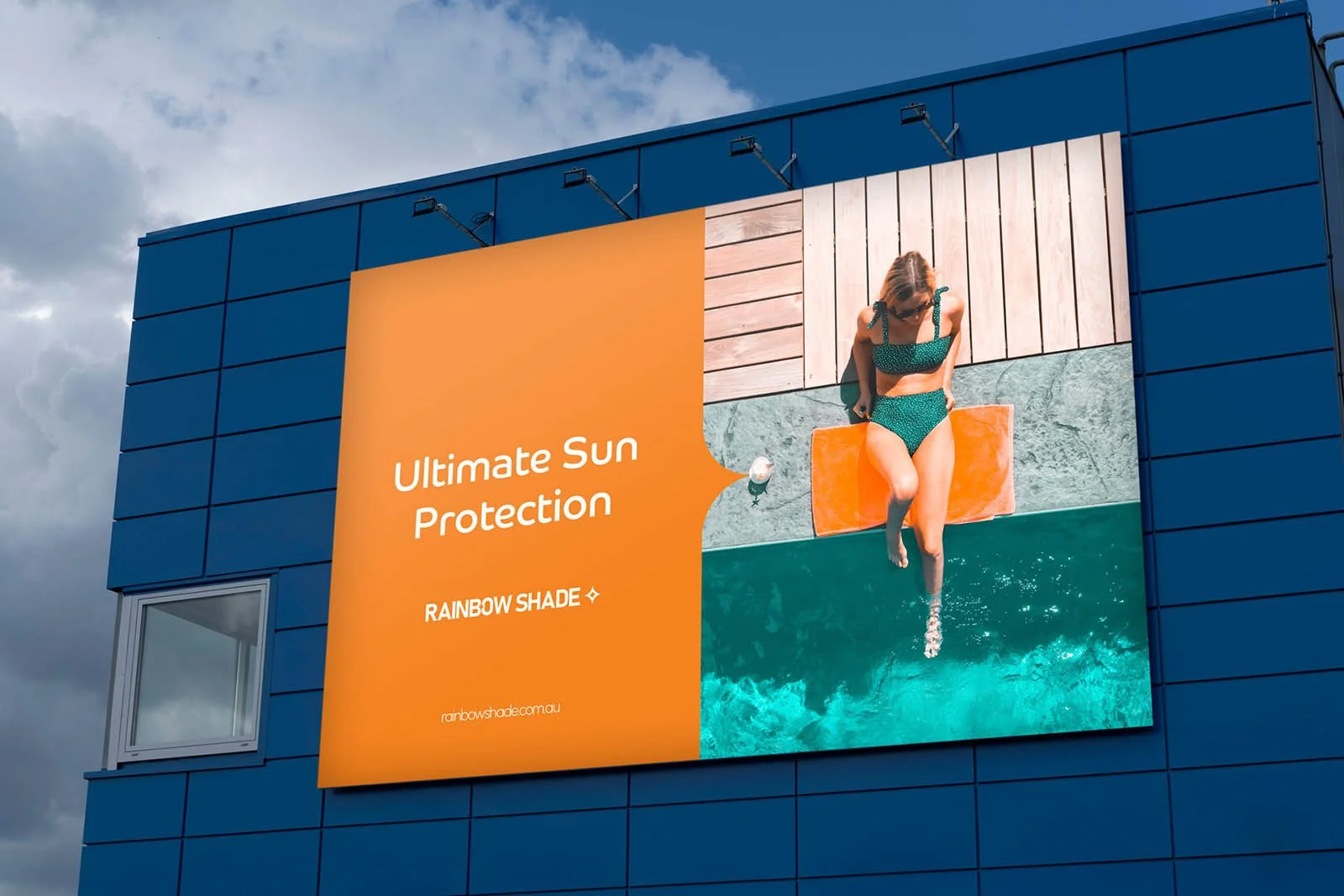
Signage
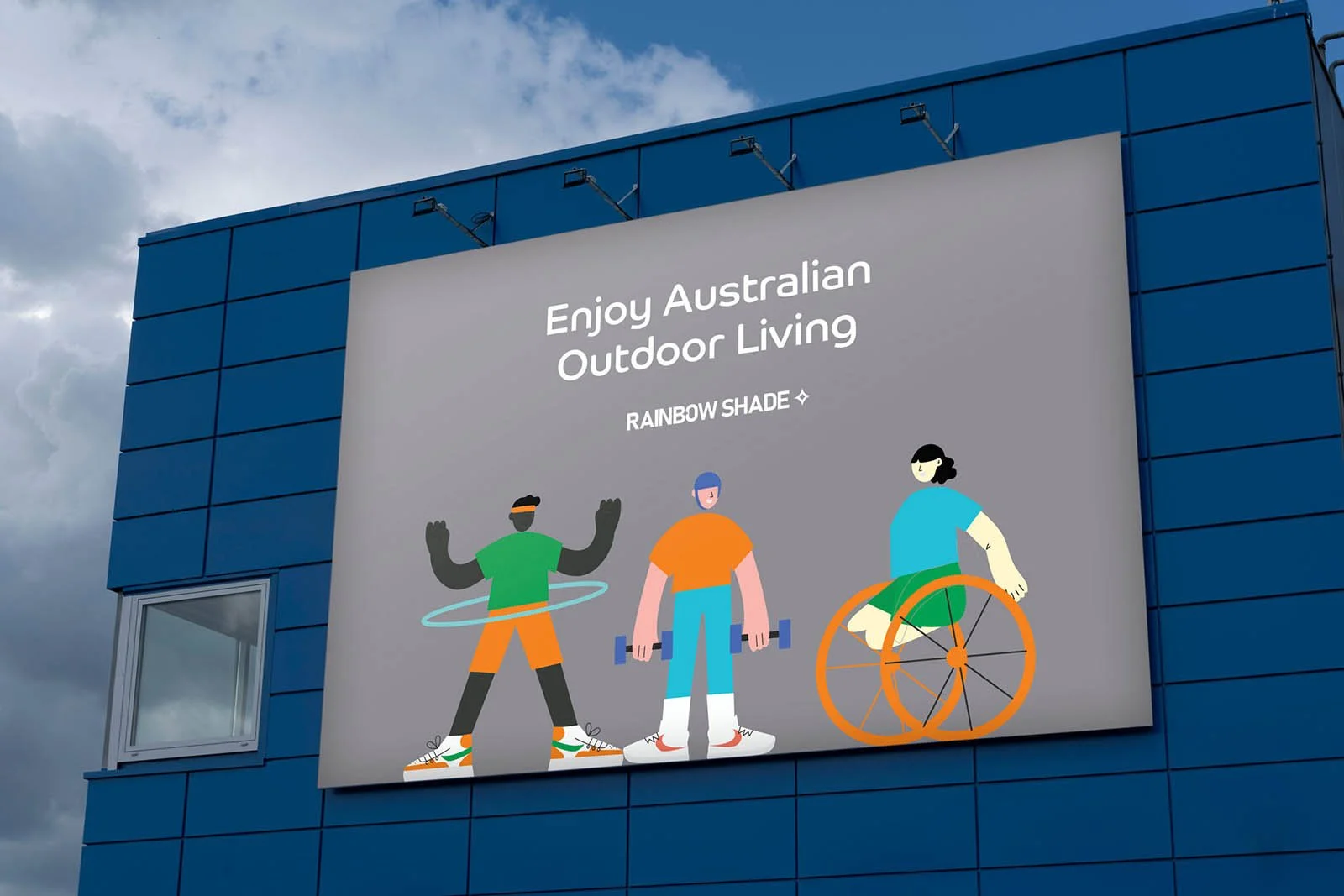
Signage with custom illustrations

Owners Manual
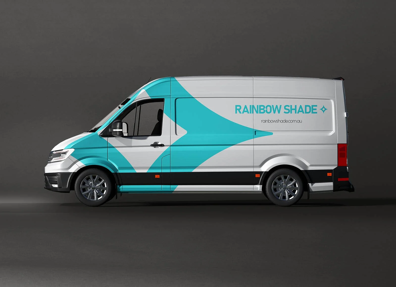
Vehicle Wrap